Tuesday 12 March 2013

Profile: Audience

The audience's feedback is an important thing during the making process and the after effects of these products.
During the time we were making our main texts, or our music videos we had to take into account what kind of audience we were looking to please.
We decided the best target audience that fitted the conventions of our music video would have been for young girls between the ages of 12- 18, the music this type of star would be singing would be catchy pop songs. The themes we would want to portray with this star image would be optimistic, colourful attitudes. To do this in our main text our star had to do quite a bit of jumping about and smiling, to induce a positive atmosphere. To expand her overall look she was wearing quite feminine clothes to again portray to the audience what her overall style was.
Real life artists who might be able to relate to this would be those like Taylor Swift and Miley Cyrus;


Both of these stars are featured in their music videos with soft lighting highlighting their features, they rarely go for anything too harsh as their star images are girly and happy and bubbly. These elements are what we wanted to include for our own star.
As our star image includes props in the music video like hats and bright make up, this portrays her like real stars like Taylor Swift and Miley Cyrus, who use these techniques, to develop a niche market to sell their alums or merchandise.

Without the audience and their feedback and general support of an artist, the music industry would most likely fail. The audiences feedback helps morph the star into something that pleases the audience, audience feedback helped our group expand our star image to what they believed would fit into the conventions as well as along with our chosen song.  

Storyboard for music video!

Above is the final story board we made to show the audience and explain to them how everything was created and why it was in such a way. It features the beginning and end shots of our video and sparingly shows the in between sections of our music video. As we used so many split screens for our music video, we didn't use every split screen in our music video, this storyboard only features the main sections of our music video and what sort angles we were aiming for. We decided to make our final storyboard using extracts from our actual music video to properly portray how we planned to make this video, and the outcomes from it. 

Wednesday 6 February 2013

Ancillary texts: Digipak

Our main aim when presenting our star in the digipak was representing many different sides to our star. Which is the main reason for our montage of our star which features many different poses of her; showing her fun and silly side.
We used the same image on our front cover as we did on posters so fans would be able to recognise the star and the would realise that this was the real album.
The song listing which is featured on the back of our digipak features the same font and colour as the star's name, which represents continuity and gives the overall affect of a clean yet abstract artist, which is what we wanted to represent her as.

Ancillary text: Poster

This is the poster we designed for our artist and the advertisement of the song and album. We shot this image in a studio which linked back to the music video as we also used shots in the studio with that same white background. The white background also further heightens the star image of an upbeat feminine and happy character.
We used a few main colours, which we reused in this image; we took the red from the stars lipstick which enabled the date to stand, which is realistic as many stars want to show the date of their album so fans know when to buy their next album or single.
While the white font in her name blends into the background when editing we used a drop shadow which then made the name of our star stand out.
The font of her name differs from the font of the title of song as we wanted to show different sides to our star which we showed through the elegant and feminine writing in her name and the fun and child like writing in the word 'Satellite'.

Evaluation Question 3: What have you learnt from your audience feedback?

This video is part of our evaluation where we explain the effects that the audience and the feedback that they gave to us and how we applied it to our video and the processes we took during the production time.

Evaluation Question 1: In what ways does your media product use, develop or challenge forms and conventions of real media products?

This is a copy of our music video however with added commentary over the top, which is basically describing how the group and I edited and put together our music video. We also explain what camera technology and the techniques we used as well as the editing and what effects we were looking for while we were in the production progress; another key feature mentioned would be the stars actions, which links to matching the visuals to the lyrics. However other conventions are mentioned in this like the mise-en-scene, which is seen as being equally important.

Evaluation Question 4: How did you use media technologies in the research, planning, construction and evaluation stages?

The research, planning, construction and evaluation stages
by: Ellahhh

Evaluation Question 2: How effective is the combination of your main and ancillary texts?

Monday 4 February 2013

Final completed music video

Due to our audience feedback we learnt that our other music video wasn't really that well shot and overall quite a complicated concept. From this our group decided to start over and go with a much simplar idea, we still stuck with the same tone for our video; being quite an upbeat and romantic tone. However this time round we used a female lead singer and fit to the typical conventiosn of a girl singing about love. For this we used the song 'Satellite' by the unsigned artist Lelia Broussard. This is our completed music video for our coursework.

First attempt at music video


This was the very first idea we had when we were trying to film for our media coursework. We wanted a romantic happy song and a leading man to take the audience on a journey. However our audience feetback showed our group how confusing the overall idea turned out to be and we realised that we didn't portray the conventions of a music video that we wanted to. Our audience feedback is the reaosn this video is not our final piece for our coursework, however this was handy to use as an example. The song featured is by the unsigned artist however famous youtuber, Alex Day - Good Morning Sunshine.

Screenshots


Below are a few images of our process of making our digipak, it shows the editing process and how we planned to have them template for our digipak.These print screens show what tools we used and how we were led to our overall end product.

Sunday 3 February 2013

Asking permission

Although our song 'Satellite' is by the unsigned artist Lelia Broussard, I thought it was a good idea to ask for permision via twitter to use her song like I did with the previous artists we wanted to use for our video.


Thursday 17 January 2013

Product Update

After the completion of our music video we then moved onto working on our digipak and poster ideas, on my blog are some other actual products from music artists, we have used inspiration from these in terms of font and colour. However now our digipack is complete with varied shots of our star from some in a studio to some outside in around the nature. Not only this as but we also created a montage of our star image for one of our sides in our digipak, this added to the abstract element that we wanted for our star image. Now our digipak is completed we are moving onto our poster to which we will feature the same image as the front of our album cover as our main image for our poster.

Album Cover Inspiration: A Fine Frenzy

This is also a key inspiration for our own front cover as we essentially are focusing on the star image like how Alison Sudol, of A Fine Frenzy is doing here.
While our album cover plans to be in colour it was nice to see one in black and white to see how it can still be expressive and fun even with lack of colour, this was a good contrast to see against our own work.
Also the lack of colour really brings into focus the orange colour of the album name, 'Bomb in a birdcage'. Even though that is the font in smaller it still is visible to the audience because of the bright orange colour.
This also features different fonts which could again show the difference of style Alison uses on this album, this is the representation we wanted to make sure we secured in our own project.

Album Cover Inspiration: Matt Corby

Matt Corby isn't actually a main feature on his own front cover, opposed to our digipak where our star is the key element.
However we can use inspiration from this album as the fonts that Matt Corby uses are quite childlike and almost handwritten, which is the look  we wanted to portray onto our own digipak.
His album cover is quite colourful and abstract however which is also a convention we had want to explore as our star image is quite an abstract one. The use of colour that Matt uses is quite varied and explosive. This use of colour can draw the audience in and entice them to listen Matt Corby and his music, hopefully our digipak will have this same affect.

Album Cover Inspiration: Lana Del Rey

Lana Del Rey's star image is very feminine, this is the sort of inspiration we needed to consider for our own album cover.
Lana has her own personalised bold font, the gold representing perhaps her high maintenance lifestyle; everything in this album is quite glamourous.
However as it is the second edition to her hit album 'Born to die' the Paradise edition is in smaller font, showing the audience that it is a second version. The font of the Paradise edition could possible lead the audience to believing that this album will feature a more feminine and romantic side of Lana which wasn't explored as fully before.
This is a big inspiration to our own digipak as our lead singer is also the main image on the front and we are also using different fonts, styles like this is something we can consider when we are in the making process.

Wednesday 16 January 2013

Album Cover Inspiration: Charlie Simpson

For Charlie Simpson's debut album as a solo artist, he featured himself as the key image for the album 'Young Pilgrim'.
The rule of third was a critical thing when creating this album cover, as Charlie himself is the main focus, he had to be central.
Audiences know straight away he is the     main star, his star image can be stereotyped as the indie type of artist, due to the fact he is holding an acoustic guitar. Not only this but Charlie is surrounded by nature, it is on a peaceful day and there is nothing surrounding him apart from the nature, which could give off quite possible folk sort of conventions. As the genre of folk can be quite unique and is typically stereotyped as a farm yard type of sound, surrounded by nature. Charlie's font of his name differs from the font of his album title. Charlies name is featured in bolder and clearer font than what 'Young Pilgrim' is, this ensures that the audience see Charlies face then his name, then underneath the album title.

Album Cover Inspiration: Ingrid Michaelson

Ingrid Michaelson's cover for her album 'Everybody' has defiantly been a big influence for us when we were working on our digipak.
Like Ingrid, in our album cover we have also used varied fonts, the reason behind this is so the star image is presented in a creative and unique. While a star may have a serious side they can also have a playful and feminine side, like what Ingrid has presented with her use of the girly 'everybody' and the artistic and child like font of her name.
Also like Ingrid we used white font this is due to the fact it gives an overall perception of being tidy and clean. However while this does contradict with the business of Ingrid's background, which could represent the 'Everybody' of being robots, animals and humans etc. This again helps show the audience what type of star Ingrid is like.

Cover Art Inspiration: Coldplay

 Coldplay are a well known band who have been around for a while throughout the years though they haven't had one style which they have stuck with.
To the left is their debut album for 'Parachutes'. The font is the same, the black background contrasts against the white font; the album seems to be very neat and clean. This helps the yellow globe stand out even more than normal.
The star image of the band is never featured on the album, the audience can infer from this that Coldplay are likely more likely to be concerned with their music opposed to what their star image is represented as.
As this is their first ever album it is easy to see the contrast from the first album to their latest one below.
This is the latest album by Coldplay, it features a lot more colour and a completely different style and font. It can be said that Coldplay have morphed and grown as an artist, using their fame and taking more risks artistically.
The use of bright colours and graffiti can be seen as the band trying to get rid of their old star image and use a riskier angle, essentially getting rid of their old plain style for a new and upbeat one. Coldplay have grown with the times through their music and their style and this can be presented in their album cover.

Album cover Inspiration: Regina Spektor

Regina is the main focus on this album cover as it mainly focuses on her and her face.
The main colours used on this album are red, white and black; this gives the album a very clean and tidy effect. This also makes Regina stand out more. However the red adds colour and a fun effect to the front cover.
The font used is quite a girly and playful one, which could represent Regina as an artist.
Audiences can judge from Regina's appearance that she isn't the typical popstar and her star image is a much more tame one, she blend in with the background, she isn't over the top unlike someone like lady gaga. Although certain elements of her stand out like the colour of her eyes, which could lead the audience to believe there are many layers to her as an artist.


Tuesday 15 January 2013

Poster Inspiration: Paramore

While this poster isn't necessarily promoting the album 'Riot!' it is interlaced into this poster as the album itself is called 'Riot!'. however the album cover does differ from this style but not by much.
Paramore's preferred genre of music tends to lean towards the rock genre, the red featured in the 'Riot!' is used to stand out and to be noticed, this word is more noticeable than the band members themselves. Who just appear to blend into the background. Not only does the 'Riot!' stand out because of the colour but also because it has been repeated, the audience cannot escape the word 'Riot!' this is a main selling point for paramore's album.

Poster Inspiration: Justin Bieber

This can be shown as Justin Bieber's advertisement for his second album 'Believe'.
The rule of third appears to be used as Bieber is central on this poster, his face is the first thing that the audience will see; This helps them recognise with the artist.
The colours used on this poster are quite mild and warm tones, while bright colours aren't exactly used here, there are lots of gold and orange tones on this poster; this can indicate how he is consider a mature artist, and has developed from his debut album.
The title of his album is featured at the bottom of the poster, it is featured in bold this helps with the sale of his album, as fans will realise what the album is called with reference with this poster.
However the font on the top of the poster differs from the font at the bottom, the top font which features his name is spaced out and in bold this gives a sophisticated feel. Again backing up the notion of Bieber trying out a new style of music for himself.

Poster Inspiration: Lady Gaga

 This poster is essentially advertising Lady Gaga's second hit album 'Born this way'.
Lady Gaga's star image has always been a shocking one, in which she uses outrageous affects to shock her audience, on this poster she does this through her make up and hair. Her hair is wild and loose yet her face is filled with little bumps which give her this unique look, the look she usually goes for.
The fact that she isn't wearing anything could indicate how she is 'born this way', also the hair and make up could symbolise how she can be a bit wild.
The font of the poster, is messy and looks like hand writing, Lady Gaga's name is in the center and a bigger sizing, this is so her audience know who she is straight away. However her audiences can still guess what the album is called as that is also on this poster.
There isn't any colour on this poster this could represent how although she is wild she still is feminine and the lighting also is used to soften her features.

Monday 14 January 2013

Poster Inspiration: Ed Sheeran

=
This poster is also selling Ed Sheeran's debut album '+'.
Sheeran uses the bright colour orange as the main theme of this poster, Sheeran's pale face stands out against the orange background.
Sheeran also has a specialised font, which unlike Florence he uses throughout all of this poster, audiences can use this for future reference for when they see that same font and instantly think of Ed Sheeran.
A good thing about this poster is the fact that his face is placed central on the poster, it is the main thing that stands out this also ensures that the audiences remember his face.

Poster inspiration: Florence and the Machine

This is an important poster for the artist 'Florence and the machine' as this not only sells her but it also sold her debut album 'Lungs'.
From the poster the audience can assume that 'Florence and the machine' is actually the girl on the front of the poster, as she is entirely central in the entire poster. The audience can infer that Florence is not the typical 'pop princess' as the poster itself is quite an abstract one, the flowers behind florence present a very feminine and ladylike image for Florence. However she has a look of content on her face as she appears to be quite bear under her essential pair of lungs. It can almost been seen to the audience that she is hiding from them.
Florence and the machine don't appear to have a set font, her name however is constantly in the same feminine font however the word 'lungs' is in bold and capitilised, the main reason for this appears to be so people recognise the album when they were to see it in store.

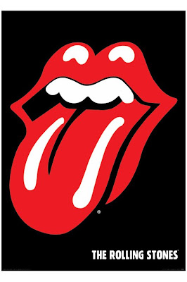
Poster Inspiration: The Rolling Stones

While 'The Rolling Stones' are a iconic and old band, they have created an iconic image which has been used over and over.
When analysing this poster one let down could be the fact that the bend themselves were not actually on the poster, while their star image is quite a notable one it might not be one that is seen straight away. However this photo is a big part of iconography with this image used all over the world, when any one from any audience and genre preference first see this image they generally first think of the rolling stones.
This is the upside to iconography, the audience know the rolling stones and even if they didn't they could infer that this is a poster for a rock band and the tongue and lip facial expression is a classic in the rock world.

Inspiration for poster: Jessie J

This is a poster of 'Jessie J' while it's not exactly advertising her album it does sell her and her star image.
The gold, bold font stands out against the black featured in her clothing, in terms of colour this poster appears to be lacking of it. However this makes the font appear to stand out that much more as it is the only colour the audience will be seeing, therefore it helps them remember her name 'Jessie J'. Another thing that helps is the fact that it is centered more or less in the middle of the poster, it is eye catching.
From this poster the audience can determine what type of artist Jessie J is, the fact that she is all in black could stereotype that she was a rock singer, however the gold font puts the audience off this general stereotype.
Her expression is a unusual one, she appears to be the rebellious sort of singer, while her songs might have a good beat that doesn't necessarily mean her songs will be optimistic.
Not only this but her face is looking straight towards the camera this portrays the idea that Jessie J is essentially looking straight at her audience.

Digipak Inspiration: Ke$ha


While Ke$ha is similar to the like of Rihanna and Katy Perry, Ke$ha represents herself as a parhty girl, her album photos are filled with many different colours, which could represents the surprise and upbeat star image she has. Many of her photos appear to be quite cosmic which could present her as quite an abstract artist.
While Ke$ha is not as extreme as 30 seconds to mars, Ke$ha could be consider as quite rock and roll.
The idea behind her album art represents the idea that she has a split personality, this shows how she has a fun side and how she could have a more serious and harder side, this can also be represented through her songs.
Many different images on her album feature her in different clothing and positions, this can present to the audience how she likes to mix things up and how her outfit with the white dress can present her innocence, further through the album you can see her wild side, like how she is photographed in a bikini top.
She is also presenting her as a sexual object to the audience, Ke$ha's star image is an interesting one as there are many different interpretations to her.

Digipak Inspiration: Katy Perry

Like Rihanna, Katy Perry also has a star image as being the typical 'pop princess'. She is presented on the album art as presenting her sexuality, making herself appear as a sexual object to the public, attracting men especially. The cotton candy covering up certain parts of her make it seem all that more intimate. The idea of candy being a main feature in her album presents her star image as a playful, childlike and overall fun image, it could represent that her songs are upbeat and fast paced.

Digipak Inspiration: 30 Seconds To Mars

The style of this digipak is much different compared to Rihanna's. This is down to the fact that 30 seconds to mars plays a completely different genre of music, leaning more towards the rock genre; unlike Rihanna.
While on Rihanna's 'Loud' album the red were used to connote passion and love, this digipak's use of red seems as though it presents itself as a blood red, an emergency sort of red. This is a typical stereotype which would seem to fit 30 seconds to mars type of music. By the cover of the digipak audiences can again assume what type of genre of music this will be, the skulls are usually a general theme of the rock genre, and as this band are apart of this genre, the themes fit well. The bands photo is a key image as while the cover art explains to the audience what genre of music it is the star image actually presents the band. However as the lead singer isn't at the front audiences can assume that each band member is equally important.

Digipack Inspiration: Rihanna

On the R&B singer, Rihanna's digipack for her album 'Loud' the main feature is of her. Rihanna is clearly playing to her star image of the feminine and lady like star. The use of red, which is a main colour on this album gives connotations of romance, passion and love which considering she is surrounded by roses would be an accurate look. The album art itself is a close up of her face this allows the audience to notice her as the star straight away. The presentation of this digipack could indicate she is going to sing about romance and love, this could also be an explanation for the pink tinge effect also added onto this album. Overall Rihanna has gone for themes of romance and love with herself as a key image to represent this.

Friday 11 January 2013

More inspiration

While the spilt screens in this video are noticable they are also more concealed this is down to the fact that the screen has spilt up the same setting.Whereas our video was more varied than this one this was a successful music video as when the lead singer goes from one frame to an other it still captures thte audience. Our video captures the audience by all the different setting sand transitions that have taken place.

Inspirations for final music video


 My group and I took inspiration from these two music videos with their use of spilt screens. . Achieving something like how Blink 182 did their spilt screen in 'Always' seemed quite difficult for us as they had fifferent band members featured in the spilt screen and as we only had one main star we would not have been able to achieve this same effect.

Completed music video

We finally completed our music video we tried to stick to the typical conventions of a music video; we especially wanted to match the tone and themes of the song.
As the song was an upbeat one we used bright colours, with the outdoors scenes we shot we used colour correction as we didnt want dark and dreary weather which could project the idea of a ngeative mood onto the audience. Instead we tried to use warm colours like oranges and reds, we shot with images in teh sun in the background to again show this happiness.
We wanted to create an abstract element so in the chorus we decided to use spilt screens but to keep continuity we used them on every chorus however we didn't keep teh angles the same for example sometimes there would be for video spilt screens, other times only two or three.
We wanted things to be fast paced so we used jump cuts in the rest of the song, we matched it to the beat of the song this overall gave our video a neat and tidy yet interesting affect.